Okay, so we all know about CO2. And most people generally accept that we should reduce the amount of it that we dump into the atmosphere. But how can you know how much CO2 your country/province/state/tiny island is emitting into the world? Luckily for you, there is a handy dandy site just for this very purpose!
https://www.electricitymap.org/?page=country&solar=false&remote=true&wind=true&countryCode=CA-AB
With the tools at your disposal from this site, you can check to see what your, or at least some of your neighbours’, energy production environment looks like. It not only lists what types of energy production that each area has, but also how much installed capacity they have, and how much they are using at any particular time. Add in 24-hour history charts and energy auction prices for the same period and you can start to get a pretty firm understanding of what makes countries able to produce energy without CO2 and for how much they can do it.
Spoiler alert! The answer is either hydro or nuclear. At least for places that require more than 1 GW of electricity. Take Prince Edward Island in Canada for example. As of writing this article, it produces a mere 11g of CO2 per kWh of electricity and it’s doing that because almost all of its energy is coming from wind. Pretty impressive right? According to this site, PEI is using a mere 31% of its 200 MW of installed wind capacity, so about 70 MW. If you remember one of my previous blog posts, there is a single cement plant in my home town that uses more energy than that on a daily basis.
Okay so how about something more in line with the first world energy demands. How about Brazil?

They show as one of the lowest GHG producing electricity generators on the map. They produce 82.6 GW of electricity from about 121 GW of installed capacity. The breakdown is as follows: 103.9 GW of it is hydro, 10.7 GW is wind, 2 GW is nuclear, and 4.2 GW is “other”.
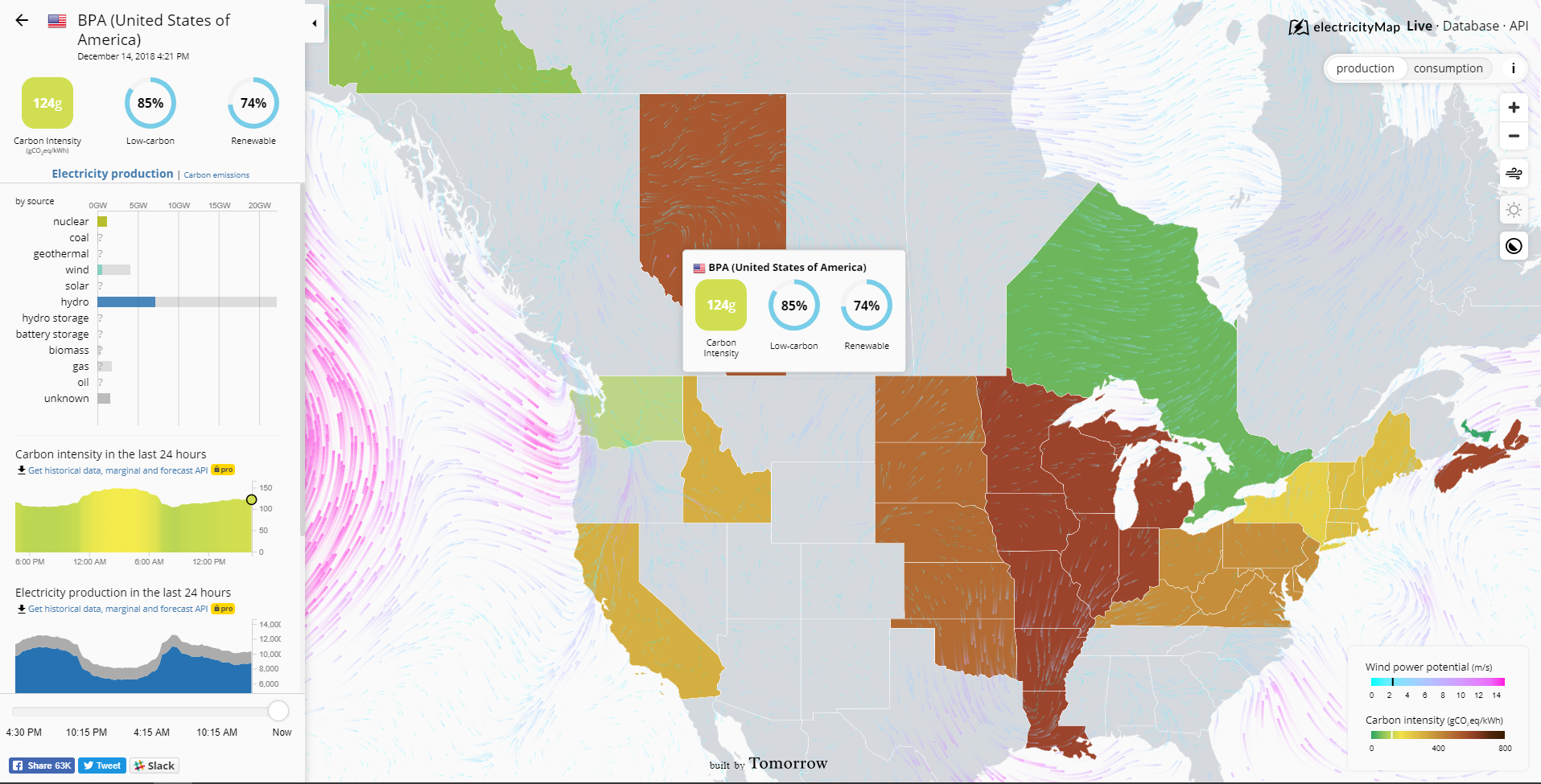
You get very similar breakdowns for other very green places like Norway, or Washinton State in the US
But on this interactive map, there are three places that are different. They are Ontario, Sweden, and France. The reason they are different is that they are the only three that have their energy grid set as primarily nuclear.
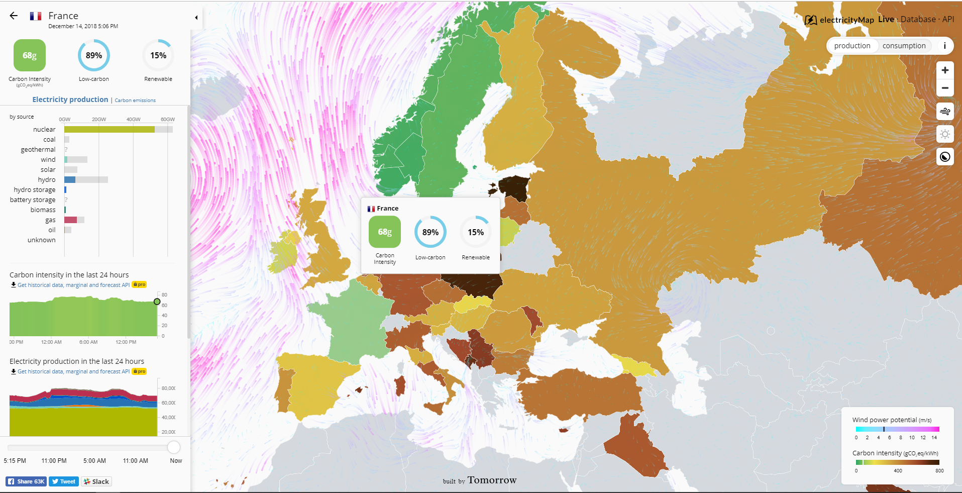
Now the reason I focused on France instead of Ontario, which is significantly closer to home, is two reasons.
1. because Ontario is currently and has been for a while, on most Albertans shit list and I don’t want any immediate knee jerk rejections of something because “Ontario is doing it, so I don’t want to”
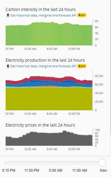
and 2. because there is a bit of data that France has at the time of this article that the Ontario and Sweden portions don’t and that is the time-stamped energy auction prices lined up with the total energy production chart and CO2 production charts.
If you look back to the previous image, you’ll see that that sickly greenish yellow colour denotes nuclear energy production. That wouldn’t have been my first choice of colour, but there we have it. Notice how the nuclear production is very very steady? Above that you have, in order, wind in light blue, solar in orange, hydro in matte blue, hydro storage in deep blue, natural gas in red, and a thin, thin line of oil in dark green. Now if the times at the bottoms of these charts seem a little off to you, it’s because of internet localizations. the times are displayed in my native Mountain Standard Time (GMT-7) while France is 8 hours ahead on Central European Standard Time (GMT+1). So those rises and falls with demand match up pretty well with the standard 8 AM- 8 PM peak hours.
So why is this important? Because if you look at the chart, you’ll notice that the auction price of electricity goes up with increasing usage. Pretty obvious I know, but really think about it for a second. Everyone that is against nuclear is always harping on about how nuclear is too expensive to use and that building new plants will increase your electricity bill. But if that was the case then wouldn’t you expect the highest energy prices to be when there were not many other options in the mix other than nuclear? Looking at this chart, you’ll see that the times when nuclear was the largest percentage of production, the prices were the lowest.
Now I will say that a sample size of 1 is pretty dodgy math, but maybe take a look at this site every once in a while and see how things shift around. You’ll most likely notice that not only does nuclear have the best record in being able to reduce greenhouse gas emissions while providing power, but also that the prices that it does it at are generally the lowest in the area.
A little side benefit is that nuclear is almost always operating at near the peak total installed capacity of it which means that to produce say 5 GW of electricity, you need to install less nuclear (~5.5 – 6 GW) than any other kind of energy generation. Cause installing 50 GW or more to get 5 GW of low carbon energy sounds like a bad, expensive deal to me. Wouldn’t you agree?


Excellent. I would also recommend the International Energy Agency’s monthly electricity stats. It has data as far back as a year, at least https://www.iea.org/statistics/monthly/#electricity (I used this data to create this post https://thstlewpg.wordpress.com/2017/03/15/international-energy-agency-electricity-production-statistics-for-oecd-countries-2014-2016/ . IEA doesn’t use the term “renewables” in these reports and it groups biomass along with fossil fuels into “combustible fuels”. Also this one for Australia and each of its states is handy, good to follow to see how they transition off of their fossil fueled electricity generation opennem.org.au
LikeLike